
As a continuation of the last post, here's the real Cupid modeling my wings.

Around V-day I painted the bathroom doors, which were formerly solid beige, with One Shot enamels.


Door handles included.

 Another sign for Baker Joe:
And this one is actually a really old "Value Added" sign, one of my first signs ever, but I thought I'd still throw it here cause I got a picture of it:


Another oldie (one of my first foamcore signs) but hey, why not:

The next Frequent Flyer to come out after V-Day was called "The Swimsuit Edition." I couldn't tell you why. The look focused around Victorian-era etchings and illustrations, as usual. I made these to decorate the Endcap signs in our store:

I think Victorian-era to 1920's stripey swimsuits are so cool that I just had someone on Etsy custom make me a slightly modernized version of one, but that's another story. Here's one of my Endcap arches in action, featuring Edwin again, who for some reason looks really natural with a handlebar mustache:

I also last-minute had to make the chandelier sign for this campaign, so I made a giant life preserver complete with actual rope during a shift.

 Then St. Patty's rolled around. I made a bunch of Leprechauns and used them to frame Irish products in the cheese and meat sections.
 Lol, everyone kept saying that this one looks like Martyn. He loved that.


Oh, and since I don't think I explained what an Endcap sign is before, it's a big blackboard sign over an end-of-an-isle display. Sometimes they are tedious and boring to make and sometimes they are fun, mostly depending on the package design of the product and whether or not you have the time to do something cool. This is how they are supposed to look, basically just lettering and price. I find this very boring and I only make them like this when I don't have much time.
 This is what they look like when I am having fun:
Yes that is an off-model cookie monster which is probably totally illegal to draw. Oh well, I guess Jim Henson shouldn't have kicked so much ass and influenced my childhood.
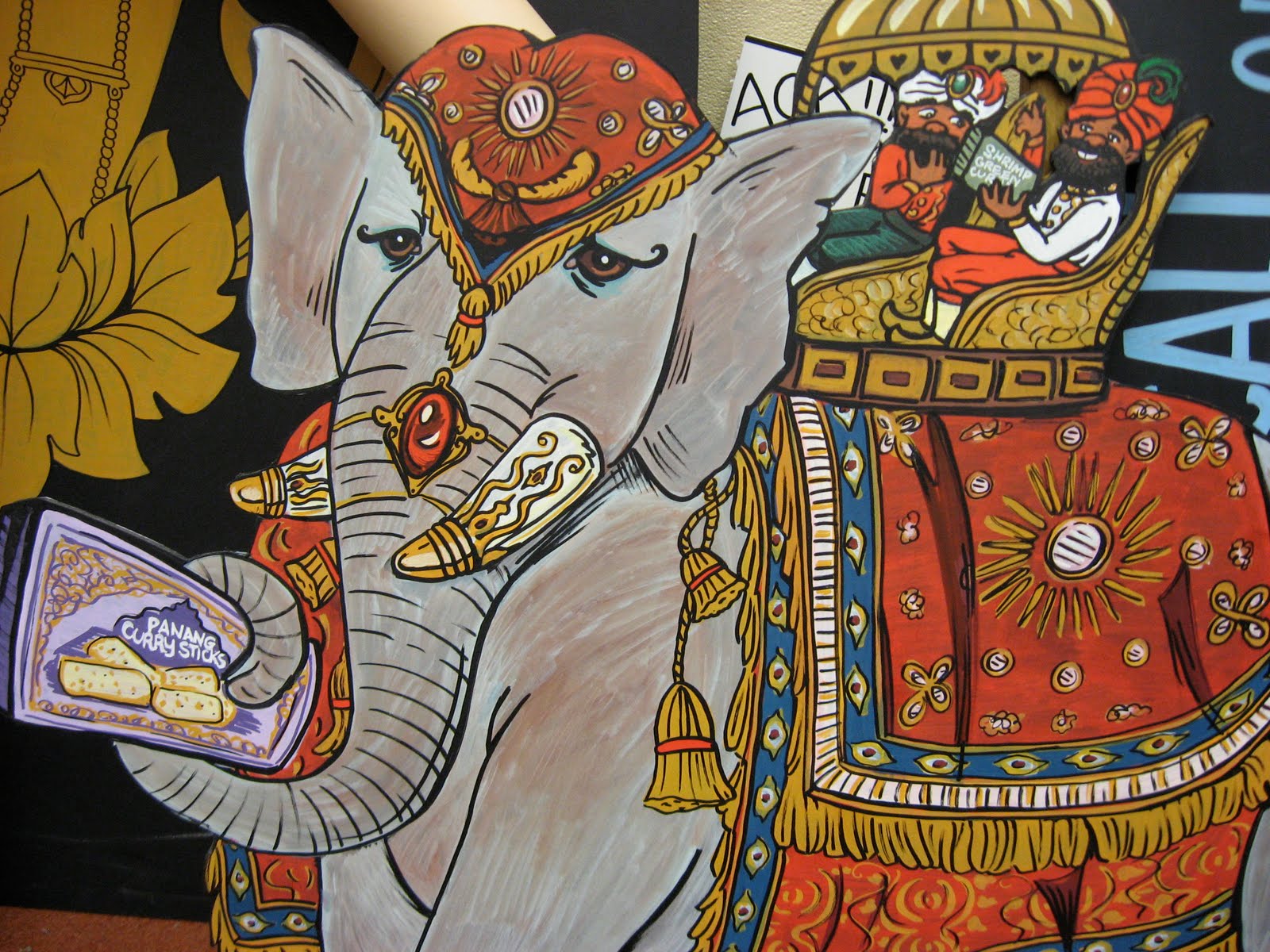
The most recent Flyer was a little ambiguous, Victorian illustrations again with no real theme and entitled the "Culinary Compendium." All we could really get from it was to stress exotic foods and travel. I had to make a "bejeweled elephant" for a mini chandelier over the frozen isle.

I actually don't have any photos of the finished product or it hanging up right now, but at least you get to see a close up of the most important part this way.
For the Endcap arches I just nicked a little creature off the cover of the Flyer and redrew him in more my style. I'm not sure what he's supposed to be...bush baby, maybe, or a lemur?

And last, here are photos of something I made today. Apparently meat sales were teh suck lately so they needed a couple signs to add "wow" to products they're really trying to push. Since everyone said my leprechaun looked like Martyn I decided to actually make a sign of Martyn advertising his favorite thing, the Irish Bangers.

In the background our grody breakroom table is featured.


Loveder!

No comments:
Post a Comment