skip to main |
skip to sidebar
Hello there. It's been forever since I posted here. I've made lots of stuff since. When I left off I was trying to figure out a style to make my illustrations for entry in the Trader Joe's Safety calendar competition. I didn't win, but hey, I tried my best. Here's what the illustrations I submitted ended up looking like.


 Perhaps they are a bit too gritty for the Trader Joe's aesthetic, but I wouldn't have them any other way. I like the new style I've been messing around with and I'll be sure to use it again in the future with my own stuff.
I also at some point in time made another pair of almost-traditional fairy wings. They were super quick ones I call my "Earth Angel" wings, probably one of a kind since I made them for my friend Devon while watching a movie. They came out pretty nice though for something so fast and easy to make. You can sort of see them in these pictures Paige took of her.

 I basically only made them because Devon was in town and we had not yet had her pose for a photoshoot. I'm still working on my own pair of wings and there will be more photoshoots on the way, but I have a feeling the ones in the nearest future are going to have a different theme to them--werewolves! Yep, I started my costumes early this year. I've already made some pretty decent Jack Goodman and David Kessler costumes from my favorite movie of all time, An American Werewolf in London. Since Paige is a short zombie lover with side swoosh bangs that likes to complain and I am a tall lumbering carnivorous lunatic with messy curls and a tendency for nudity we've always known that we are Jack and David.


I'm really surprised we never thought about this costume before. We dressed as the boys on the moors for the Little Five Points Halloween Parade this past Saturday. Our makeup was a strange mixture of drag and gore. I had never tried doing any FX makeup before so it was fun trying to come up with a way to do Jack's massive face and neck wound.

I ended up building around a rectangular neck wound appliance by Woochie called "chomped" with lots of liquid latex, pieces of sheer pantyhose, and of course fake blood. Here's my version of Rick Baker's makeup.

Reflection in a mirror, of course. Like some sort of undead Myspace profile pic.

 Though the Jack makeup definitely got the most attention, I thought my David getup came out alright too.

Mmmm, that medium rare Tazmanian Devil burger was so worth the wait for the Vortex. A happy werewolf was I.
 I really like the wig I found for this, it really completed the awkward young Jewish werewolf look.
 Here's a shot of my dude makeup that completely fooled half the people at The Junkman's Daughter.
 They had no idea who I was and I hang out with these people all the time. It's amazing how a few carefully placed marks with an eyeliner pencil can completely change peoples' perception of gender.
 Sexy.
Sexy.
 Rawr! That's me with the amazing Japanese poster for the movie, which is now in my living room. And here's a final shot of me looking lost.
 I'm glad there's at least one shot of the feet so far. I can't wait wear them with my other costume as well, which will be a more involved punk-rock-shewolf or basically me as a werewolf. I'll be trying that one out for the first time this Saturday (which is of course, a full moon.) Will post pictures as soon as I have them!
I haven't posted here in forever. I probably will soon with some substantial stuff, but for now here is my interpretation of our friends the time we went to Chattanooga.

I got Devon from Junkman's to pose this time with my Anarchy in Purple wings. Paige took the photos in and around my apartment.
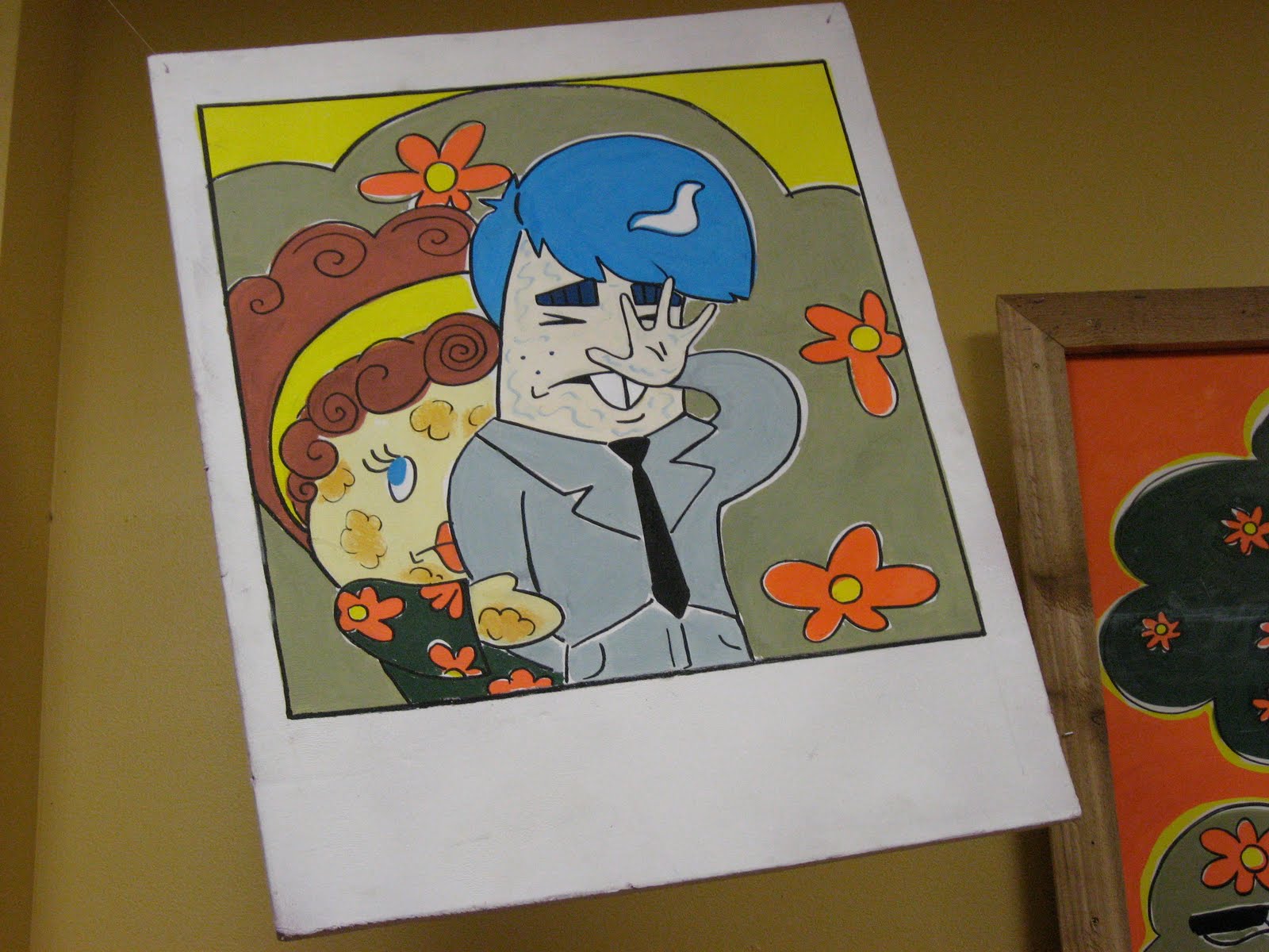
 They are now for sale on Etsy. Meanwhile at Trader Joe's I was working on stuff for the latest Flyer, which dropped yesterday. The theme was early 1960's mod, the slogan was "Be Seen on the Green." I was assigned to make the big sign for the vestibule, or front entrance. It was supposed to be some new products sunning themselves in the park with sunglasses on and avoiding the paparazzi. The color scheme was orange, avocado green, and beige. I was also meant to make two decorative pieces to flank the vestibule sign that are giant polaroid photos of the products "getting caught." This is what I came up with.


 You might be able to tell I watched the movie Quadrophenia while making this. Martyn and I decided if we had lived in those days he would have been a mod and I would have been a rocker, so I guess we would have had to have had a forbidden romance. Since I seem to side with the rockers so much I had to include some of them in my vestibule sign, even though in real life mods and rockers may have sooner killed each other than relax in a park together. I guess depicting gang wars is not exactly up to Trader Joe's standards.
Speaking of Trader Joe's, recently we were promoting Goddess dressing by having two crew members dress up as Goddesses and roam the store with samples. Here they are getting ready in the break room, and why I love working in Midtown.

Stephen is the one on the left and an experienced drag queen. He had to do Danny's makeup because it was his first time. I love how nervous Danny looks in this picture.

Stephen leans back to look at his work while Danny tests it out.
 The wig (or "the rat".)
 Jen is in the background here "mouth breathing".
 And finally, enter the Goddess!
 Danny totally rocked that role. So did Stephen the following day, despite my lack of pictures.
I just posted two pairs of newly photographed fairy wings on DeviantArt and Etsy!
My friends Andrea and Blair modeled for us and Paige took the photos. Paige's DA
As you can see, she's great. She took many beautiful photos which she is now in the process of editing and manipulating them like she does. I snagged a couple from her where the wings are more prominent to use for my listings. Here is how they appear, complete with descriptions:
Anarchy Wings
My Anarchy wings were inspired by the punk aesthetic of the seventies and the Sex Pistols. They were built over a sturdy metal armature and measure twenty inches from back to tip. They are constructed of scraps of hand-torched faux leopard fur and destroyed red plaid that are being held together by safety pins. The lower parts of the wings are crafted of jeweler’s wire and ‘citronella’ Angelina Fusible Film. They are an extremely iridescent material that shimmers in the light and reflects all sorts of interesting colors over the intricate wire “veins” embedded inside the wings. My wings come complete with clear elastic bra straps for wearing them backpack-style over clothing. The straps are adjustable and also removable; just unhook them from the attached loops when you would like to tuck the back brace of the wings into a corset or bra for a more realistic look. My wings are flexible and durable enough to bend into a shape that properly contours your back and then stay that way. Also feel free to pose the wings upright and apart for a perkier look or tuck them down and together into a resting position for rock concerts, clubs, or eating in restaurants. *Also available in a purple, with purple and orange plaid, purple leopard fur, and orangey-pink 'raspberry sparkle' Angelina fusible film. Will post a listing when I get photos.Sex Pixie Wings
 These wings were made for a true sex kitten to wear, inspired by burlesque, New York Doll-type sleaze, and vintage lingerie. Fashioned from sturdy metal anchor wire and armature wire, they measure twenty-four inches from back to tip. My Sex Pixie wings are constructed hand-torched faux leather that have been corset-laced on both sides with hot pink satin ribbon. On the other side of the lacing is pale pink lace that has been thoughtfully shredded by my sister’s Jack Russell terrier, a true artist of destruction. When you hold the wings up to the light you can see the fine glittery dark pink plastic ‘veins’ that have been embedded within the lace. The lower sections of the wings are quite flexible and crafted from pinup-inspired sheer polka dot glitter fabric. These wings are trimmed with an assortment of recycled satin garters and loads of antique lace. They bear the signature kiss of Quarley on the upper segment of the left wing. Look carefully and you will find a several hooks and fasteners from antique garter belts dangling from the edges. My wings come complete with clear elastic bra straps for wearing them backpack-style over clothing. The straps are adjustable and also removable; just unhook them from the attached loops when you would like to tuck the back brace of the wings into a corset or bra for a more realistic look. My wings are flexible and durable enough to bend into a shape that properly contours your back and then stay that way. Also feel free to pose the wings upright and apart for a perkier look or tuck them down and together into a resting position for rock concerts, clubs, or eating in restaurants.
Here are some more signs/Trader Joe's artwork I have made since my last post. Sorry, I don't have photos of my actual outside-of-work artwork yet.
As a continuation of the last post, here's the real Cupid modeling my wings.

Around V-day I painted the bathroom doors, which were formerly solid beige, with One Shot enamels.

 Door handles included.

 Another sign for Baker Joe:
 And this one is actually a really old "Value Added" sign, one of my first signs ever, but I thought I'd still throw it here cause I got a picture of it:

 Another oldie (one of my first foamcore signs) but hey, why not:
 The next Frequent Flyer to come out after V-Day was called "The Swimsuit Edition." I couldn't tell you why. The look focused around Victorian-era etchings and illustrations, as usual. I made these to decorate the Endcap signs in our store:
 I think Victorian-era to 1920's stripey swimsuits are so cool that I just had someone on Etsy custom make me a slightly modernized version of one, but that's another story. Here's one of my Endcap arches in action, featuring Edwin again, who for some reason looks really natural with a handlebar mustache:
 I also last-minute had to make the chandelier sign for this campaign, so I made a giant life preserver complete with actual rope during a shift.

 Then St. Patty's rolled around. I made a bunch of Leprechauns and used them to frame Irish products in the cheese and meat sections.

 Lol, everyone kept saying that this one looks like Martyn. He loved that.


 Oh, and since I don't think I explained what an Endcap sign is before, it's a big blackboard sign over an end-of-an-isle display. Sometimes they are tedious and boring to make and sometimes they are fun, mostly depending on the package design of the product and whether or not you have the time to do something cool. This is how they are supposed to look, basically just lettering and price. I find this very boring and I only make them like this when I don't have much time.
 This is what they look like when I am having fun:
 Yes that is an off-model cookie monster which is probably totally illegal to draw. Oh well, I guess Jim Henson shouldn't have kicked so much ass and influenced my childhood.
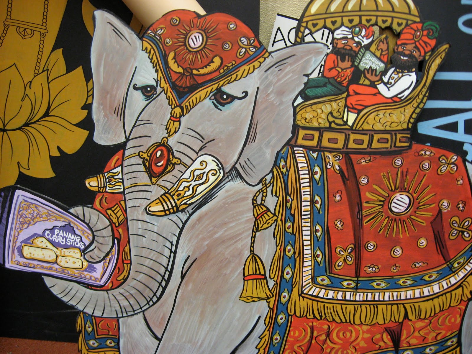
The most recent Flyer was a little ambiguous, Victorian illustrations again with no real theme and entitled the "Culinary Compendium." All we could really get from it was to stress exotic foods and travel. I had to make a "bejeweled elephant" for a mini chandelier over the frozen isle.
 I actually don't have any photos of the finished product or it hanging up right now, but at least you get to see a close up of the most important part this way.
 For the Endcap arches I just nicked a little creature off the cover of the Flyer and redrew him in more my style. I'm not sure what he's supposed to be...bush baby, maybe, or a lemur?
 And last, here are photos of something I made today. Apparently meat sales were teh suck lately so they needed a couple signs to add "wow" to products they're really trying to push. Since everyone said my leprechaun looked like Martyn I decided to actually make a sign of Martyn advertising his favorite thing, the Irish Bangers.
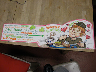 In the background our grody breakroom table is featured.

 Loveder!


 We made out.


 Perhaps they are a bit too gritty for the Trader Joe's aesthetic, but I wouldn't have them any other way. I like the new style I've been messing around with and I'll be sure to use it again in the future with my own stuff.


 Sexy.
Sexy.


 They are now for sale on Etsy.


 Another sign for Baker Joe:


 Then St. Patty's rolled around. I made a bunch of Leprechauns and used them to frame Irish products in the cheese and meat sections.
 Lol, everyone kept saying that this one looks like Martyn. He loved that.


 This is what they look like when I am having fun: